Micro-Interactions in UI/UX: The Small Details That Quietly Drive Conversions
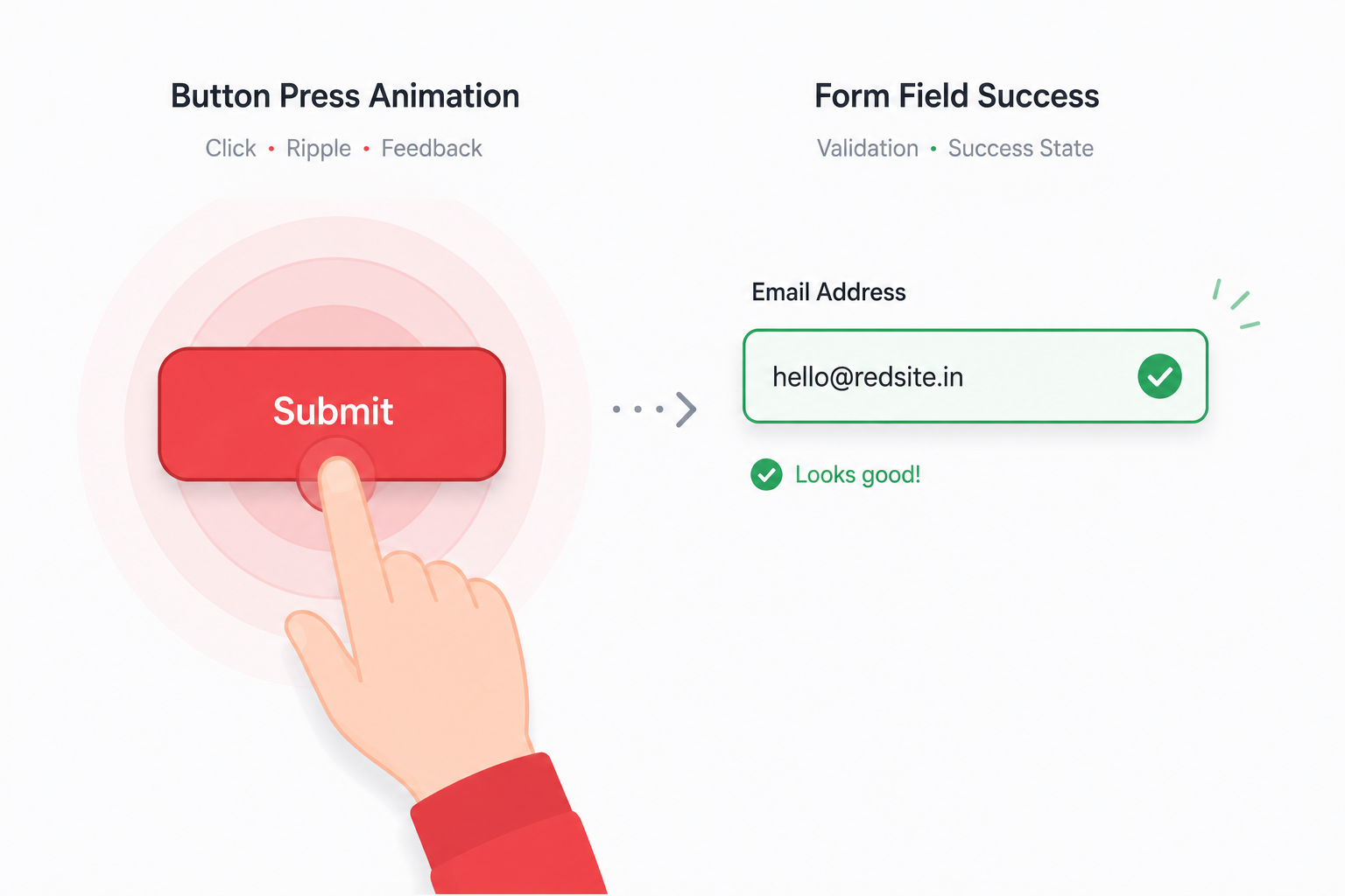
Most users can't articulate why one website "feels" better than another with near-identical content. Often, the answer is micro-interactions — the small, momentary responses a site gives when someone hovers, clicks, types, or scrolls. They're easy to overlook because, when done well, users never consciously notice them. They only notice their absence.
What Counts as a Micro-Interaction
Micro-interactions are the tiny feedback loops built into an interface:
- A button that subtly changes color or scale on hover, confirming it's clickable.
- A form field that validates an email format in real time, rather than only after submission.
- A loading state that shows a skeleton screen or progress indicator instead of a blank pause.
- A success animation after adding an item to a cart, confirming the action registered.
- A subtle shake or color shift on an invalid form submission, drawing attention without a jarring error page.
None of these are decorative extras. Each one answers an unspoken question the user has in that moment: did that work?
Why They Affect Conversions
Every interaction without feedback creates a small moment of doubt. Did the click register? Is the page frozen or just slow? Multiply that doubt across a full checkout flow or signup form, and hesitation compounds — often ending in an abandoned session, even when nothing was technically broken.
Well-designed micro-interactions remove that doubt at each step, which has a direct, measurable effect on form completion rates, checkout completion, and overall session trust. They're also one of the lowest-cost, highest-leverage UX investments available, since they don't require restructuring an entire page — just refining the response to actions that already exist.
Where Teams Get Micro-Interactions Wrong
Overdoing it. Excessive animation on every element slows perceived performance and becomes noise rather than feedback. Micro-interactions should clarify, not decorate.
Ignoring load on lower-end devices. Heavy CSS or JavaScript-driven animations can themselves cause the very lag they're meant to mask, particularly on older mobile devices.
Inconsistent feedback patterns. If a hover state behaves differently across similar buttons on the same site, it undermines the sense of a coherent, trustworthy interface.
Skipping accessibility. Motion-based feedback needs to respect prefers-reduced-motion settings and always pair with non-motion cues (color, text, icons) for users who rely on assistive technology.
Designing Micro-Interactions That Actually Help
- Start with the moment of uncertainty. Identify every point in a user flow where someone might reasonably wonder "did that work?" — that's where a micro-interaction belongs.
- Keep feedback under 300ms. Anything slower starts to feel like lag rather than responsiveness.
- Match the interaction to the stakes. A subtle hover state is enough for low-stakes actions; a clear success animation matters more after a purchase or form submission.
- Test on real devices, not just design mockups. An animation that feels smooth in Figma can stutter on an actual mid-range phone with real network conditions.
Bringing This Into a Custom Build
Because micro-interactions live in the code layer — CSS transitions, JavaScript event handling, animation timing — they're far easier to implement precisely in a custom-coded site than to force through a page builder's generic component library. This is one of the quieter advantages of a hand-built frontend: every interaction can be tuned to the specific flow it belongs to, rather than inheriting a one-size-fits-all default.
If you'd like a second opinion on where your site's interactions might be creating hesitation instead of confidence, a free instant website audit is a good starting point, or you can see live examples in the portfolio. For a full walkthrough, book a free 30-minute consultation.